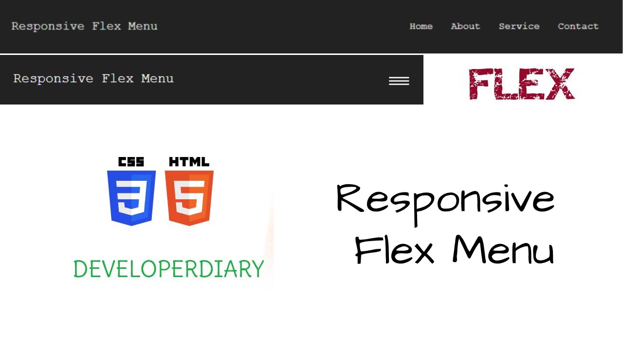
In this tutorial, you will learn how to make equal flexbox responsive menu for beginners. I have used some trial and error methods so beginners can understand very easily. And relax while watching the video. You will get the proper results in the end.
You can watch the full video and understand better way step by step.
1. Create HTML File index.html
<!DOCTYPE html>
<html>
<head>
    <meta charset='utf-8'>
    <meta http-equiv='X-UA-Compatible' content='IE=edge'>
    <title>Responsive Flex Menu</title>
    <meta name='viewport' content='width=device-width, initial-scale=1'>
    <link rel='stylesheet' type='text/css' media='screen' href='style.css'>
    <script src="https://ajax.googleapis.com/ajax/libs/jquery/3.5.1/jquery.min.js"></script>
    <script>
        $(document).ready(function(){
            $('.toggle').click(function(){
                $('.item').toggle();
            });
        });
    </script>
</head>
<body>

    <nav>
        <ul class="menu">
            <li class="logo"><a href="#">Responsive Flex Menu</a></li>
            <li class="item"><a href="#">Home</a></li>
            <li class="item"><a href="#">About</a></li>
            <li class="item"><a href="#">Service</a></li>
            <li class="item"><a href="#">Contact</a></li>
            <li class="toggle"><span class="bars"></span></li>
        </ul>
    </nav>
</body>
</html>
2. Create CSS file style.css
*{
    margin:0px;
    padding:0px;
}

body{
    font-family: 'Courier New', Courier, monospace;
}

nav{
    background: #222;
    padding: 20px;
}

a{
    color:#fff;
    text-decoration: none;
}

ul{
    list-style-type: none;
}

.menu{
    display: flex;
    align-items: center;
    flex-wrap: wrap;
}

.menu li{
    font-size: 16px;
    padding: 15px;
}

.logo{
    flex: 1;
}

.logo a{
    font-size: 20px;
}

@media all and (max-width:768px){
    .item{
        width: 100%;
        display: block;
        align-items: center;
        text-align: center;
        display: none;
        order:3;
    }

    .toggle{
        order:2;
        cursor: pointer;
    }
    .logo{
        order:1;
    }

    .bars{
        width: 30px;
        height: 2px;
        position: relative;
        display: inline-block;
        background: #fff;
    }

    .bars::after, .bars::before{
        content: '';
        width: 30px;
        height: 2px;
        position: absolute;
        display: inline-block;
        background: #fff;
    }
    .bars::after{
        top:-5px;
    }
    .bars::before{
        top:5px;
    }
}


